Sacombank unveils brand repositioning for new development phase
Sacombank unveils brand repositioning for new development phase
Sacombank on December 25 announced an update to its logo and officially unveiled its brand repositioning, marking a new phase in the bank’s development journey.
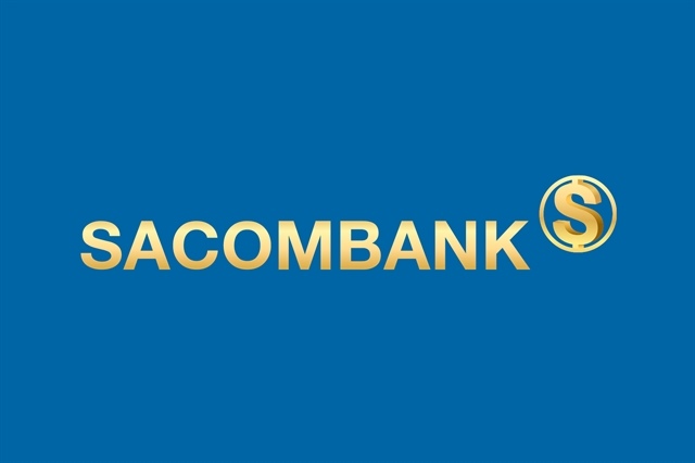
Sacombank’s new brand identity. — Photo courtesy of the bank |
Sacombank has announced an update to its logo and officially unveiled its brand repositioning, marking a new phase in the bank’s development journey.
At certain moments, a bank needs a symbol that is calm enough to inspire trust yet strong enough to lead into the future. Sacombank’s new logo was introduced in that spirit – not to differentiate through appearance alone, but to affirm a development phase defined by depth, standards and sustainability.
The new logo adopts a minimalist yet decisive design language. The brand name “SACOMBANK” appears in uppercase lettering with strong, well-balanced strokes, conveying stability and reliability. The understated typography reflects discipline, standardisation and efficiency – key attributes of a financial institution entering a more mature stage of growth.
The central focal point of the logo is a stylised letter “S” enclosed within a closed circle. At its most direct level, the “S” represents the first letter of Sacombank, evoking a brand long familiar to generations of customers.
At a deeper level, the horizontal stroke within the “S” suggests global financial flows, symbolising Sacombank’s role in connecting value and integrating into the modern financial ecosystem. The soft, flowing form of the letter also recalls Việt Nam’s S-shaped geography, reinforcing the bank’s identity as a Vietnamese institution developed in Việt Nam and committed to the nation’s long-term prosperity.
The letter “S” embodies three core values: Stability, reflecting a solid financial foundation and effective governance; Sustainability, underscoring a commitment to long-term growth that balances the interests of the bank, shareholders, customers and the community; and Success, expressing the aspiration to create lasting value for customers and investors alike.
Surrounding the “S,” the closed circle symbolises assurance, safety and integrity, while also representing a continuous flow of finance in which Sacombank acts as both connector and enabler.
The logo retains the bank’s signature deep blue and metallic gold palette, selectively inheriting brand heritage while adapting to a new context. Blue conveys trust and sound governance, while gold represents value, prosperity and sustainable achievement. Together, the colours form a harmonious identity – calm without being conservative, and modern while preserving a distinct brand character.
Sacombank’s new logo communicates maturity and resilience. It reflects a bank that has navigated multiple economic cycles and recognises that sustainable value is built on strong foundations and disciplined governance.
More than a visual refresh, the logo is a brand statement. It signals Sacombank’s transition toward in-depth development, with a focus on governance standards, operational efficiency and long-term responsibility.
Applied consistently across all touchpoints, the logo stands as a symbol of trust and partnership, reflecting the bank’s commitment to innovation, resilient value creation and long-term prosperity for customers and the wider economy.
- 16:10 26/12/2025